Sensis - Pitcher Sales App
Client
Sensis
What I did
Lead UX: Ethnographic research, user testing, workshops, high fidelity wireframes
Project Summary
A digital sales tool for Sensis customer service representives.
Due to confidentiality not all details and processes can be disclosed
The challenge
Sensis is one of Australia’s leading marketing agencies with multiple brands such as Yellow Pages, White Pages, True Local and Skip. They offer services such as website creation, SEO (Search Engine Optimisation) and SEM (Search Engine Marketing) and data solutions. With a large array of products and a very varied client base (ranging from sole-contractor plumbers to large multinational corporations) their sales process and communication needed to be broad and flexible. Besides having a broad customer and product base, the business also had several different forms of sales and customer service staff - ranging from call centre to face to face. The main challenges were:
- With so many different facets of the business there was no centralised location to source information and no clear uniform processes for selling services.
- Likewise with an incoherent product and sales deck for customers there was an overwhelming amount of information that was explained and presented differently with each contact with the business.
- This often resulted in confusion and a paralysis by choice with too many products presented to to the customer - resulting in the customer not commiting to any of them
There was no centralised location to source information and no clear uniform processes
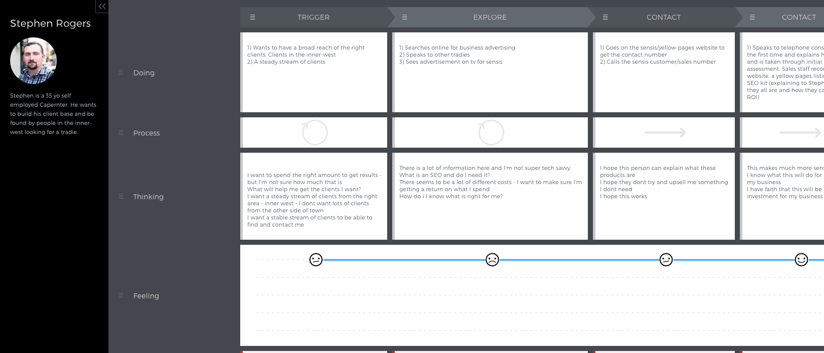
Part of a user journey map for an external customer persona
Discovery phase
We started the field research with contextual enquiries and diary studies. Double jacking with the call centre staff for a period we learnt what their processes and pain points were. We were able to establish internal and external personas that gave us insight to their motivations - which informed the whole design process. We undertook stakeholder interviews and workshops. This turned senior management and influencers into our advocates, gave us a better insight into business goals and processes and helped to onboard them with the project
The personas and supporting documents like user journeys were the cornerstone of our whole design process. We also did an internal audit on all the sales collateral and tools that staff were using and performed heuristic evaluations. Together with the consumer team we completed a priority matrix to help discover what was valuable from these tools, what was not and how we could look at a content strategy to amalgamate them.
Learnings - call center staff
Sales staff did not have the tools and resources they needed to accurately inform a customer. Examples of this were insights into return on investment, SEO reach, statistics about a particular postcode or area. To fill this gap many staff had come up with ingenious hacks and self made tools (such as excel spreadsheets) and while this aided their sales, it resulted in inconsistent and disjointed communication from one sales representative to another. We also found that when presenting such a large volume of information over the phone, customers often became overwhelmed and began to tune out after a certain point. Sales staff had hacks for these too - if they could email a visual deck before the phone call there was an 70% higher instance of the customer not only completing the call - but signing up. The visual component helped in terms of comprehension for the customer, but also added extra interest to make the call seem shorter and more engaging. Complex processes or ideas were also more easily absorbed with fewer questions from the customer.
LEARNINGS - face to face
The field study with the face-to-face staff resulted in another set of challenges. Unlike call centre staff face-to-face staff had the ability to use visual aids and present the customers with documents. Some were more antiquated and carried reams of printouts and some were more modern using tablets Our learnings were:
- Those who used tablets were relying on a stable internet connection - often using tools like google - or in some cases competitors sites - to showcase work.
- The paper presentations were susceptible to wear and tear and were also quite labour intensive in terms of organisation
- in face-to-face meetings customers were more than happy to spend up to an hour with a rep, compared to just 20 minutes over the phone. This informed our strategy going forward - that it needed to be adaptable in scale, size and detail for our different forms of agents
- Even with the help of visual aids, the mismatched messaging between call centre staff and face to face was a source of tension with customers
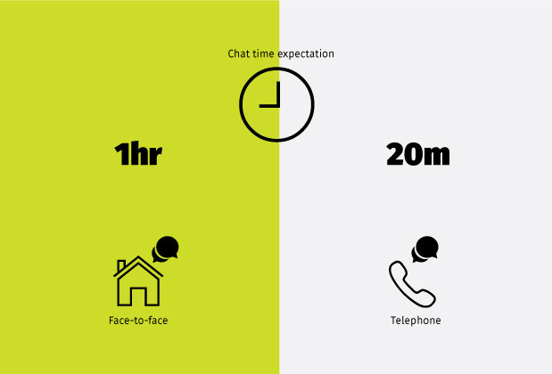
Customer expectations for presentation lengths
working out where things belong
With our external personas defined we started working on the IA and taxonomies to make our product easily understood. We started with open card sorts and what we found was:
- Our categorisation was heavily based on business goals - not user goals
- Many of the abbreviations that was assumed “common knowledge” such as SEO and SEM were, in fact, not
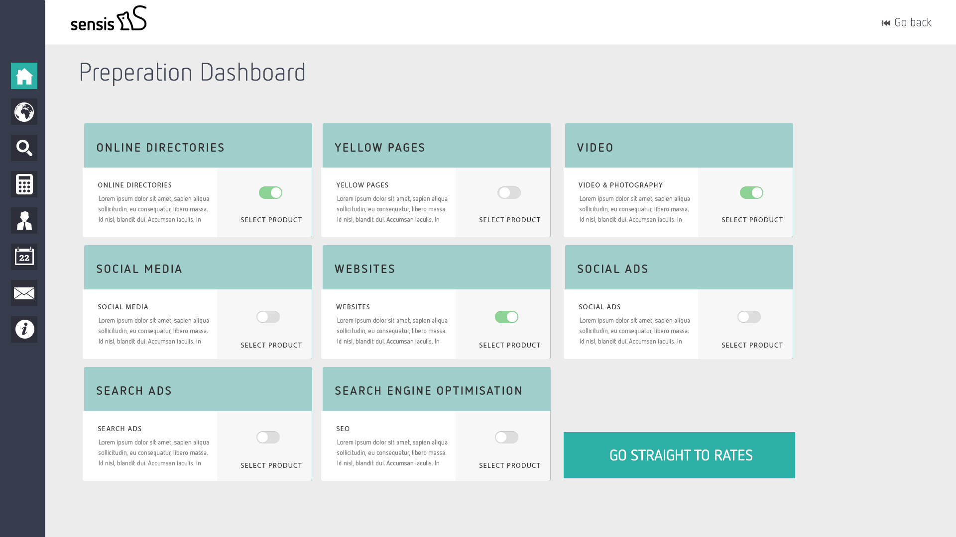
A dash to select products that are valuable to the customer - showing only what is relevant and reducing interaction load
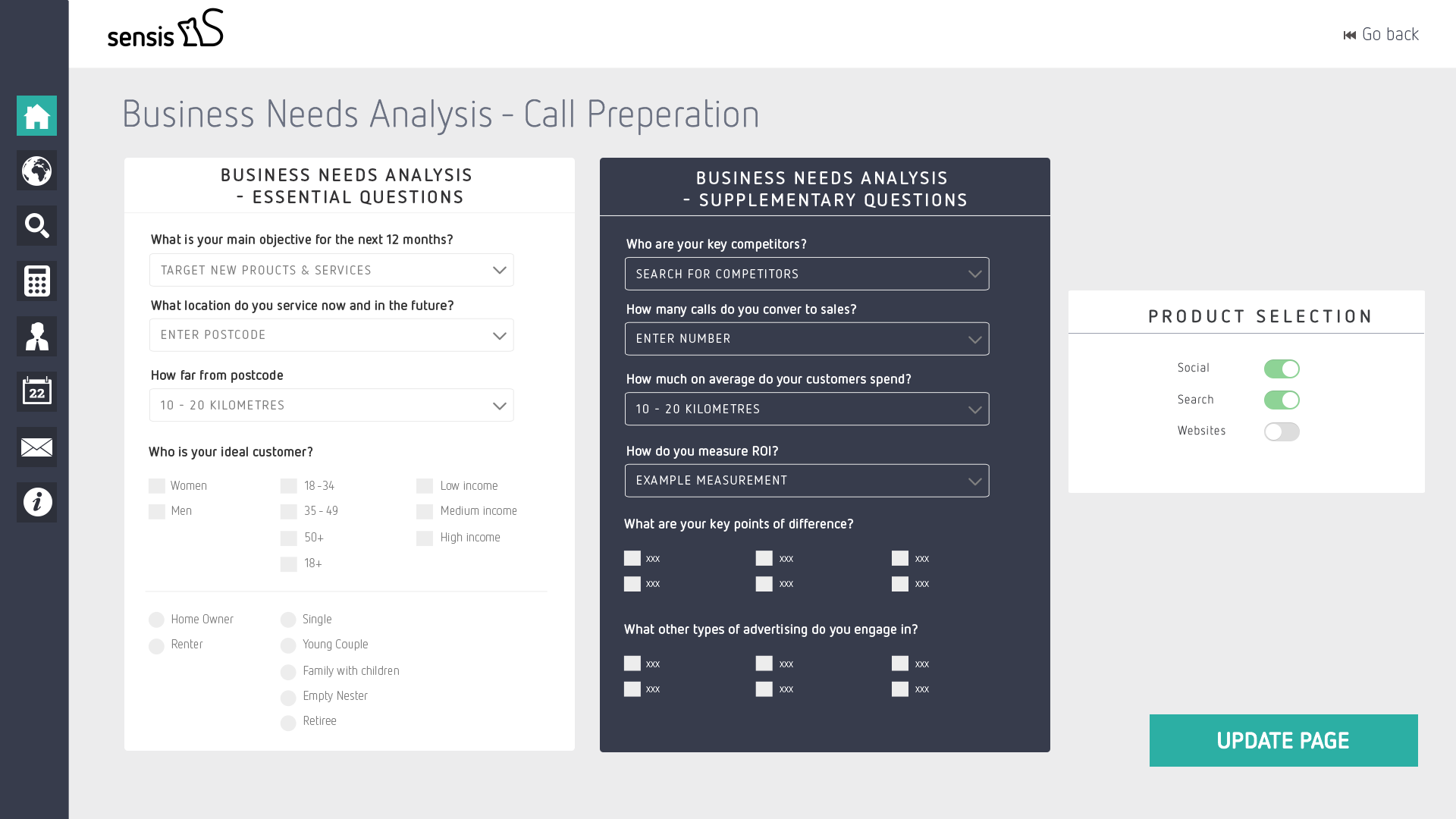
The Business Needs Analysis helped to focus the call reduce interaction load
DESIGN GOALS
We started on the design for the sales tool Pitcher. Our goals and aims were:
- Consistent information for all customers
- Digestible amounts of information, formatted and presented in a way that would fit the mental model of potential customers
- A smart journey - we wanted to assess the customer and present only the information that was relevant
- A tool that was sympathetic to context of use - slow internet connections, noisy environments - it needed to be adaptable
- Something that could easily be shared during a phone call - we needed to establish a way for call centre staff to present to customers in real time.
- Something that could be accessed offline as well as on - for those times face-to-face reps did not have a stable internet connection.
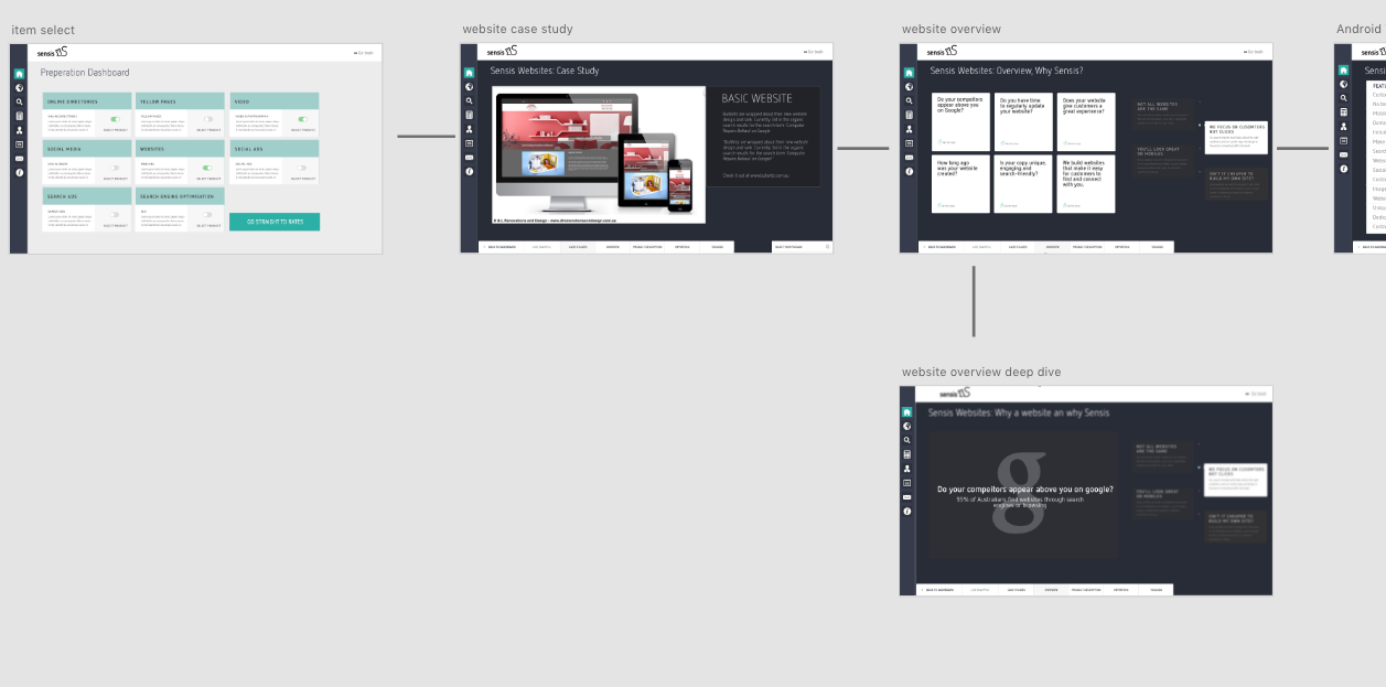
Site Map and Flow of the app - a linear progression - including deep dives. The left to right and up down matched our users mental model
DESIGN AND IMPLEMENTATION
With our to-be user journeys, clear IA and completed content we set to work on the design. Working in a Lean UX mode we tested early wireframes and tested content. By the time we had reached high fidelity/finished design prototype testing most of the issues had been ironed out. With early testing we were able to A/B test content and the flow of the presentation.
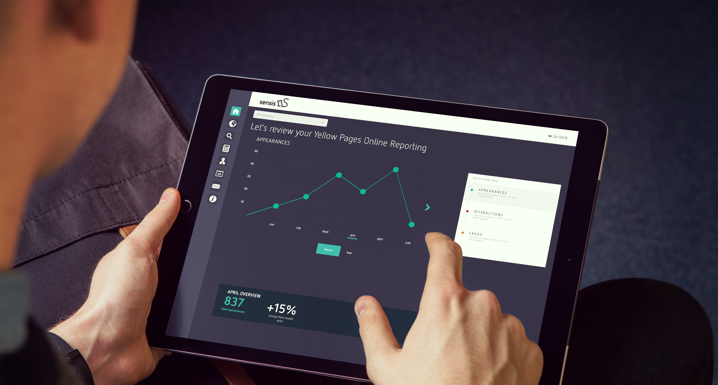
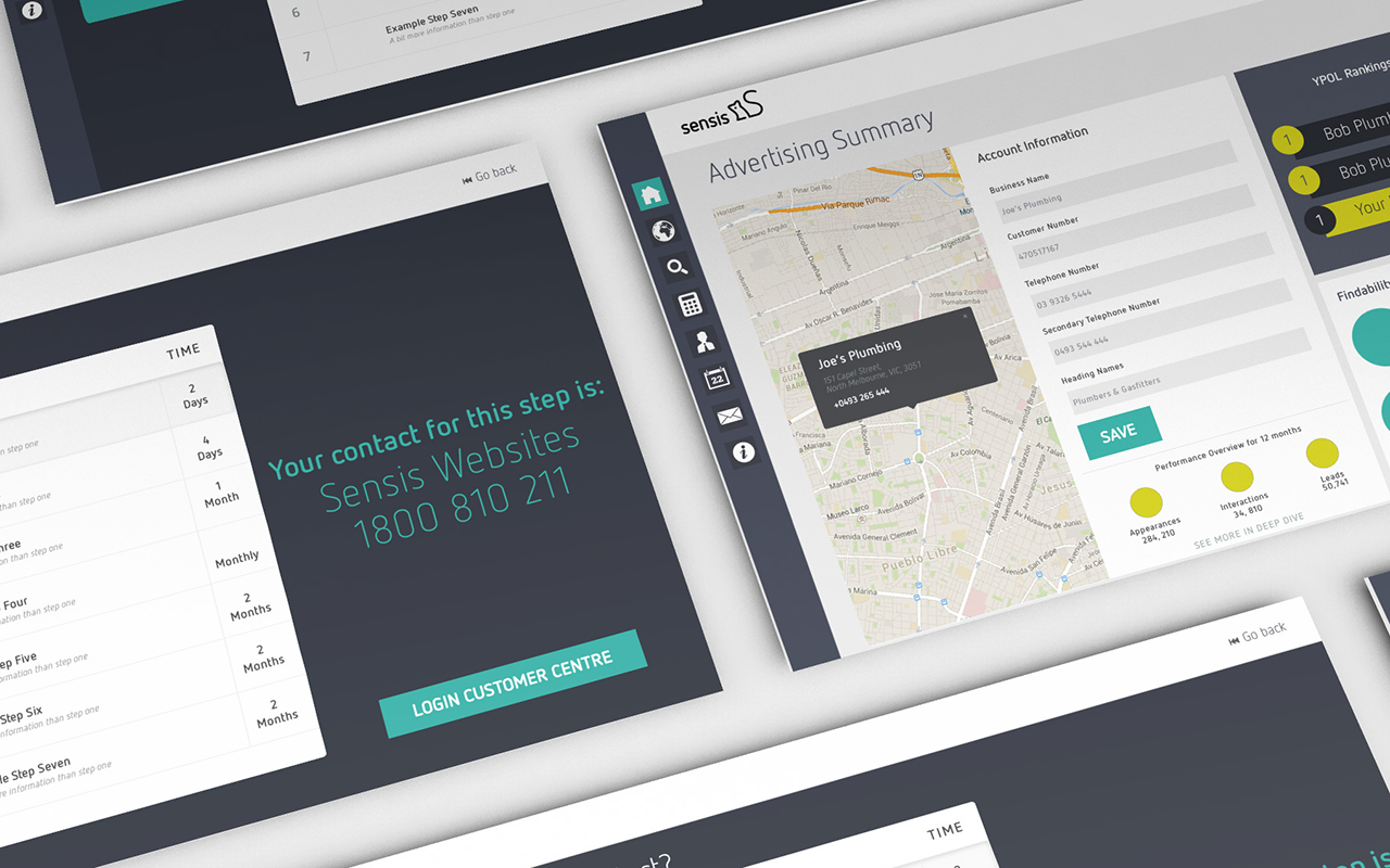
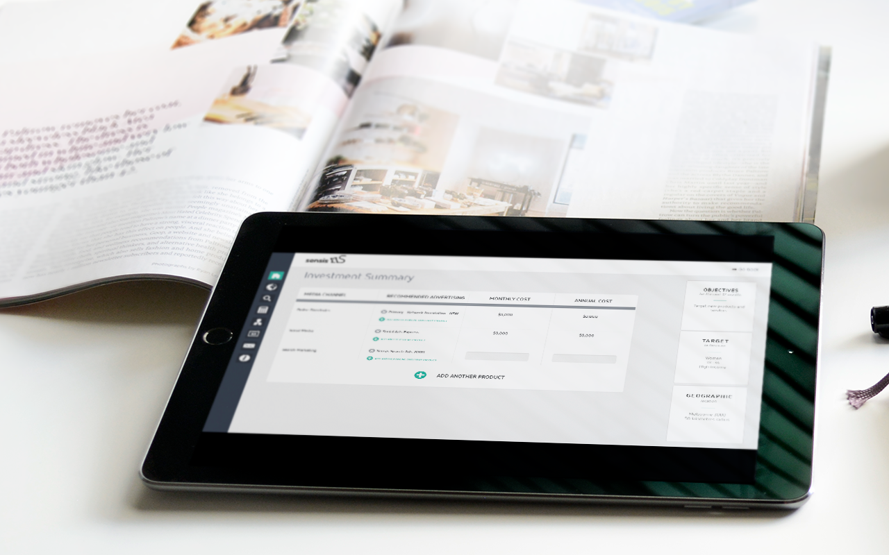
The sales tool started with a customised evaluation of the potential customer, and from that the recommendation engine prioritised the most important/valuable product to the customer first - based on their goals. Moving forward each product was sectioned out with the ability to deep dive and get more granular if required, or to stay top level. With a clear linear structure sales reps had the confidence to know what was coming up next and how to progress with the discussion - likewise the customer could clearly see progression and where they were at in the journey. The expectations were managed better on both sides.
The Outcome
With the launch of Pitcher:
- call times were up (this was not a bad metric in our book - customers were engaged for longer and sales calls were completed - compared to earlier when they were less engaged and ending the call)
- customer retention was up - especially over the phone