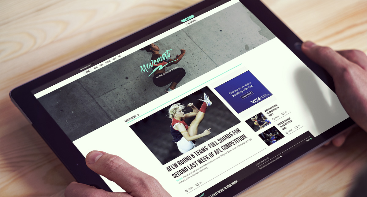
Movemnt
Client
News Corp
What I did
Art direction, Design, Brand and Identity Workshops, Lead UX
Project Summary
With the successful launch of the Women's AFL league - AFLW - there was a clear appetite for women's sport and fitness. This website was a dedicated space for women's sport, fitness and health.
Due to confidentiality not all details and processes can be disclosed
The challenge
Our goal for this project was to create a centralised hub for all things women's sport. Historically within both the business and the sports section women's sport had been sidelined or overlooked. With the successful launch of the AFLW and the enthusiasm of the audience there was an opportunity to create a stand-alone website that focused on women's sport, fitness and health. We understood that there was an audience on the main masthead sites, but were unsure as to whether a stand alone site would been seen as actually sidelining. We needed to investigate not just the motivations of our user base but also their values
We needed to investigate not just the motivations of our user base but also their values
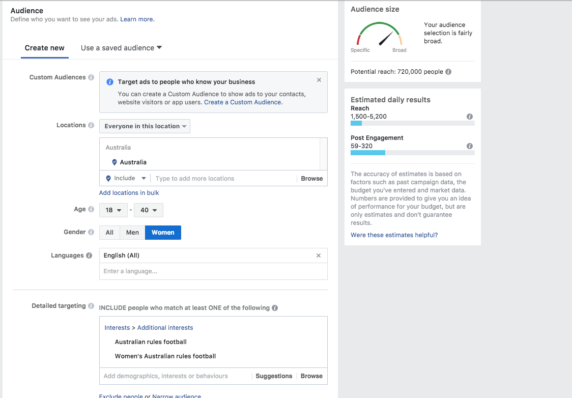
Audience participation shot of aflw and afl for women in australia ages 18 to 40
What we did
We started off broad - working with our insights team to develop a profile on who our audience was and their demographics. Starting with some top level surveys we collected qualitative data on what their interests were, reading behaviour and content interests. We established early on, though user interviews and focus groups, that having a stand-alone website was not seen as sidelining and would be celebrated. We needed to see then what would motivate the audience to visit this stand alone site (rather than continue to consume news from the standard Mastheads such as The Herald Sun). The initial surveys proved invaluable, however we wanted to discover more and along with the Project Manager and Customer Insights we ran 4 brand personality workshops.
Design Execution and Validation
We ran 4 seperate brand personality workshops broken up into various age groups. We explored what current websites and apps they were using and their motivations for doing so. Our brand workshop contained four distinct phases
- Brainstorm possible values and attributes for the brand
- Separate those into what belongs and doesn’t belong to it
- Group the ones which belong into abstracted groups
- Distill them into values, key attributes and analogies
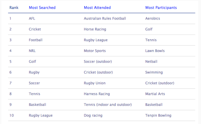
Sports ranking as developed by our insights team
LEARNINGS AND DESIGN SOLUTION
While our assumption that different age groups sought information from different sources (Snapchat vs Pinterest for example) our assumption that the brand personality would differ was incorrect. Each age group were in agreeance that they wanted a brand that was strong, focused, determined - and to steer clear of stereotypical feminine branding - such as pastel colours or pink. They wanted to see women who were "fit" and "real" - as opposed to celebrity thin. As the bones of the site was already pre-determined from our molecular design system and we were reusing grids, structure, navigation form and ad kits - it was moreso an exercise in applying the brand layer. We focused on embodying the "active", "strong" descriptors into our visual style and logotype which was workshopped with the focus groups.
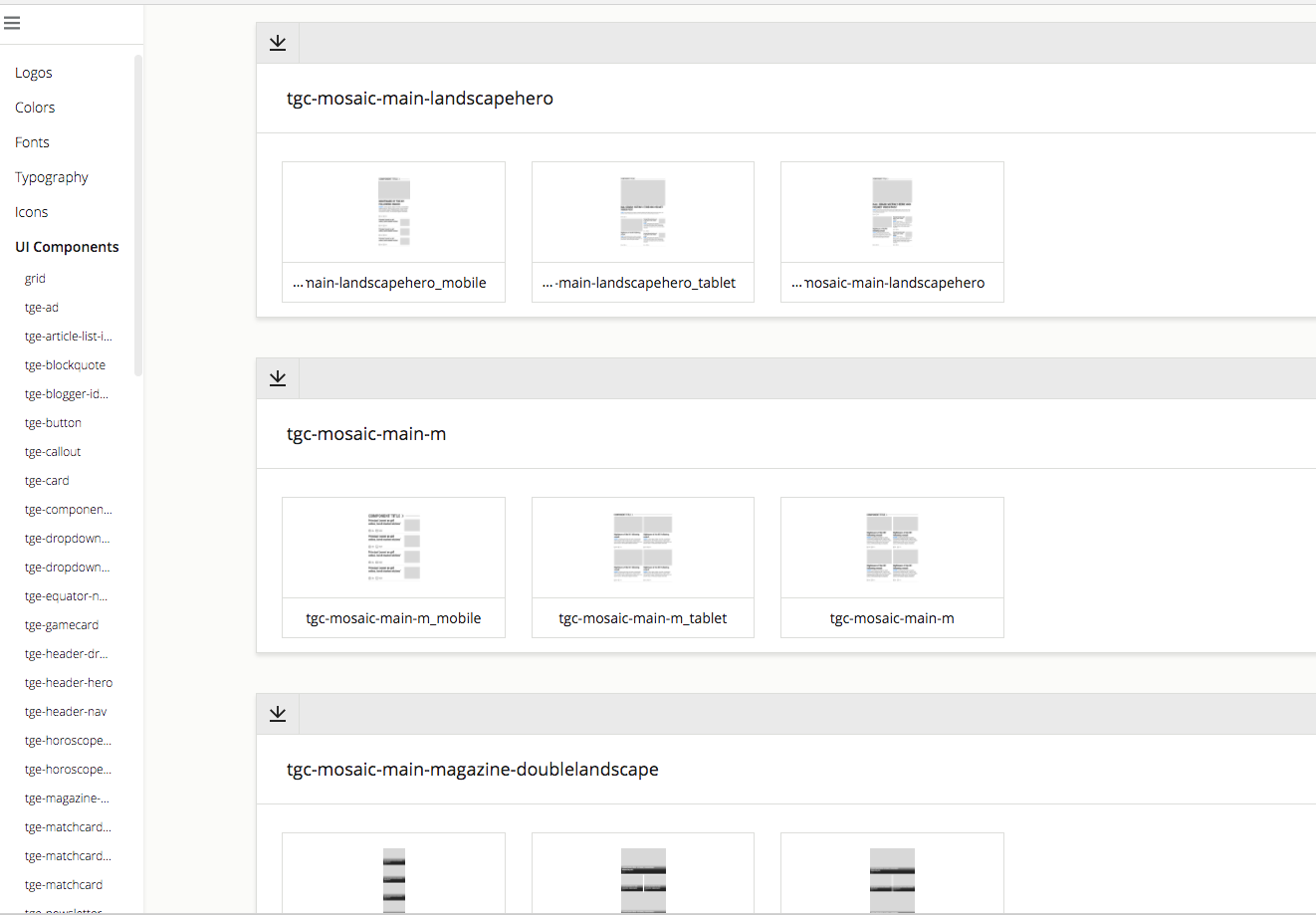
Part of the design system/styleguide
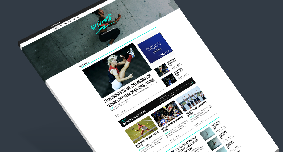
Movemnt homepage
The outcome
Movemnt was born (orginally it was 'Movement' however the emphasis on 'men' in a brand for women was seen as offputting) After our research and workshops we had established and created extremely detailed and nuanced personas that informed our design and business decisions (not just for this project, but others within News Corp). We were also able establish use cases and discover the best way to reach the particular audience segments. Using an existing design framework provided us with a tested and stable platform to efficiently and quickly apply the brand layer that we had workshopped.