News Corp Masthead Iteration
Client
News Corp
What I did
Lead UX: Qualitative and quantative data collection, heuristic review, analytics review, heatmapping, usability testing, workshop facilitation
Project Summary
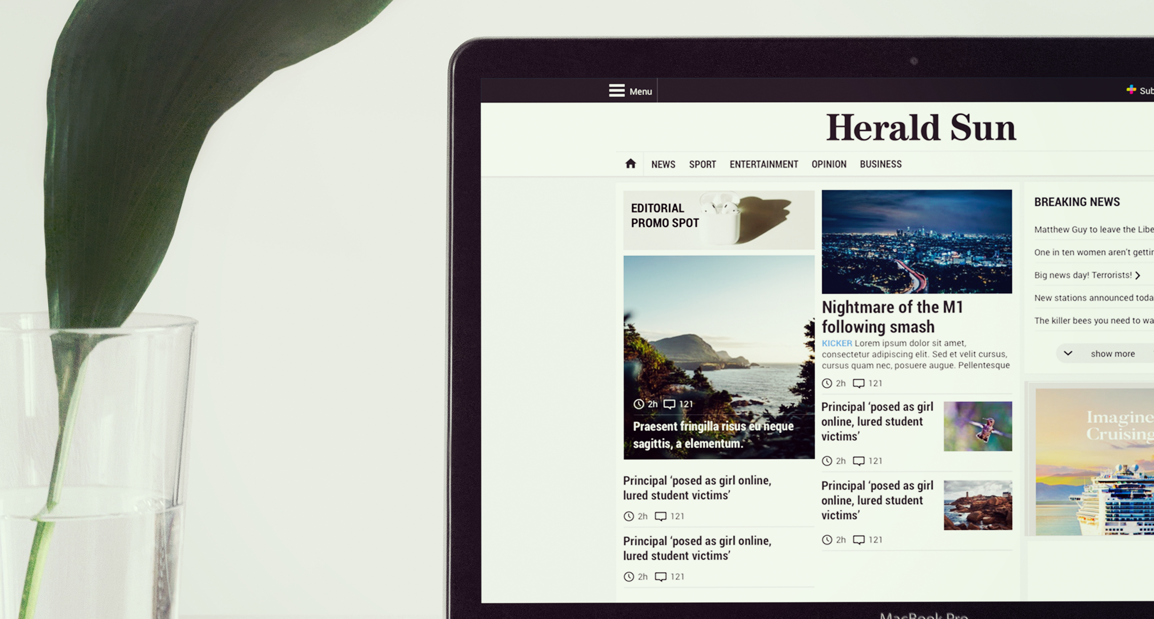
News Corp's masthead newspapers amalgamated to the one platform and design system. Post launch I was Lead UX to see what our users thought and what improvements could be made
Due to confidentiality not all details and processes can be disclosed

The challenge
News Corp's digital masthead newspapers amalgamated and used the same design system and platform. My role was to assess how well this new design system was performing for a broad and varied user base across the country and to recommend ways to improve it. Post lanch of the new design we:
- Collected 20,000 feedback reponses with both qualitative and quantitive data
- Ran heatmaps and scroll maps and paired this with analytics insights to see where we could improve and to paint a fuller picture of how users were engaging with the site
- A/B tested various modules (eg more detail on the homepage vs less detail.)
- Remote usability testing - testing our hypothesis
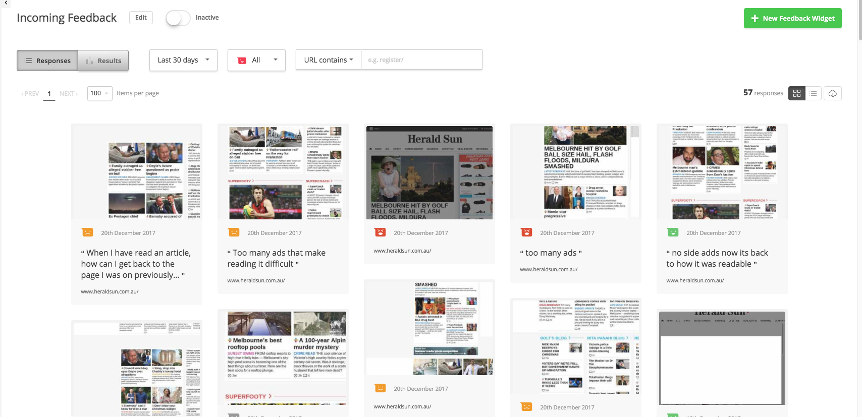
Snapshot of the feedback from readers
Collection Phase
We started by analysing the data from users and categorising them into a few main funnels. They were:
- Size and scale - the size of components (while great on large screens) were quite large on smaller screens - increasing interaction load and frustrating users (we validated this by looking at browser statistics etc)
- Advertising. The site had changed the ad kit and introduced larger, persistent advertising
- Content vs Advertising. The ratio of advertising compared to content on a users screen was not in the favour of content. Users wanted to see at least 60% content and at points there was more than 80% advertising in the viewport
- Content vs chrome - the large header and logotype area was very frustrating for users. Again, all they wanted to see was content - not internal branding. This was an internal desire to have a large masthead - not a user one.
Going back to the business
During the earlier design stages of Masthead Reimagined there were many competing business and internal objectives. Many of these resulted in design tradeoffs which, after launch, we realised were a major source of frustration for our users. With many parts of the business heavily invested in the product (and also emotionally invested) we needed to get buy in. Travelling to each state we conducted workshops with editorial, sales and marketing from each paper - getting them to empathise from the users persepective and to see the pain points that they would have otherwise missed.
outcomes
As this is an ongoing project I am limited in discussing the more detailed outcomes and strategy for going forward. However by pairing insights from surveys, analytics, remote user testing, A/B testing and heatmaps we were able to make design and usability recommendations that would strengthen the product. Through a collaborative workshopping apporach we were able to establish buy in from parts of the business that may otherwise be blockers.
.png)